This week Lorinda picked Trina's photo NYC. I love the variety of bright colors in this one. I think there were a lot of options and I can't wait to see what everyone else came up with!
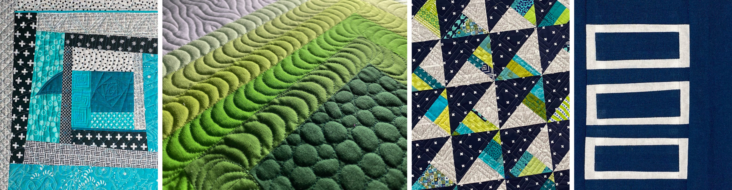
I created my palette with Palette Builder 2.1 by Play Crafts.
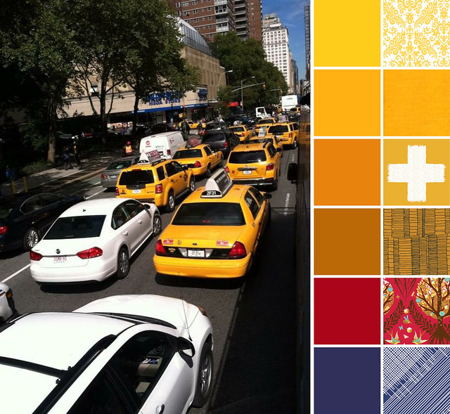
This week I really wanted to make an effort to include some non-blender fabrics. I ended up with one. I'll call that a partial win. I like that Tree of Life in Cinnamon brings in some of the yellows/golds with the red background. And once I saw the Manuscript print I just had to use it. I really like the lines. Both Manuscript and the Ladder Lines made me think of the lines you see when you're looking at a street full of buildings in New York City.
Solids:
Kona Canary
Kona Sunny
Kona Amber
Kona Cedar
Kona Tomato
Kona Regal
Prints:
Medium Damask in Yellow on White by Riley Blake Designs
Woven in Butter by Kaffe Fassett, Westminster/Free Spirit
Crossed Impressions in Solar by Katarina Roccella, Art Gallery
Ladder Lines in Yarrow by Carolyn Friedlander, Robert Kaufman
Tree of Life in Cinnamon by Tula Pink, Westminster/Free Spirit
Manuscript in Navy by Amy Sinibaldi, Art Gallery
Check out the other palettes this week at:
- Laurel, Poppy & Pine - Lorinda
- In an Otter Life - Trina
- Quilting Mayhem - Mindy
- Shimmy and More - Stephanie
- Sew Not Perfect - Bethany
- Quilty Dream - Yvonne
See other palettes on Instagram at #colorplayfriday.
If you'd like to participate in Color Play Friday you can visit In An Otter Life or Laurel, Poppy and Pine for the rules, their contact information, and next week's photo.
Thanks for visiting!


Trina
Your palette is so warm and inviting!
sarah
Post authorThanks. I really wanted to focus on the yellows from the cabs.
Lorinda Davis
I love all the colors you pulled out of this picture! That Manuscript print is one of my favorites right now. You're right; the lines in your choices really do reflect the lines you see in a big city!
sarah
Post authorThank you, Lorinda.
Bethany
I'm always so impressed at the way others put warm colors together. All those reds, yellows and oranges look fantastic together. I tried this weekend to work with a really warm palette, but ended up putting those away and grabbing the cooler colors. This bundle though appeals to me greatly and certainly evokes the NYC image. I love that plus and Tree of Life.
sarah
Post authorI generally gravitate to the cool colors, so this palette is outside my norm of my normal projects.