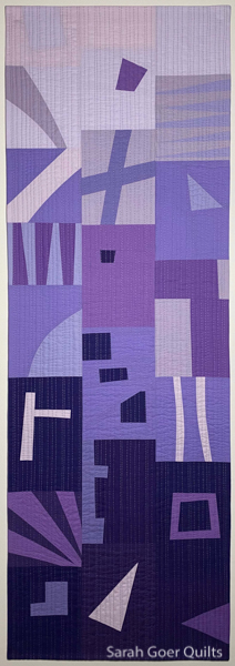
I have finished and submitted to my first SAQA (Studio Art Quilt Associates) exhibition. The Northern California/Northern Nevada region issued a call last summer for a juried regional exhibition entitled Prism Play. From the start I loved the vision for this exhibition. The quilts are all required to be 15" wide by 45" long and monochromatic, following one of the color cards from Joen Wolfrom's Ultimate 3-in-1 Color Tool. The selected quilts will hang in multiple full color spectrum groupings during the exhibition.
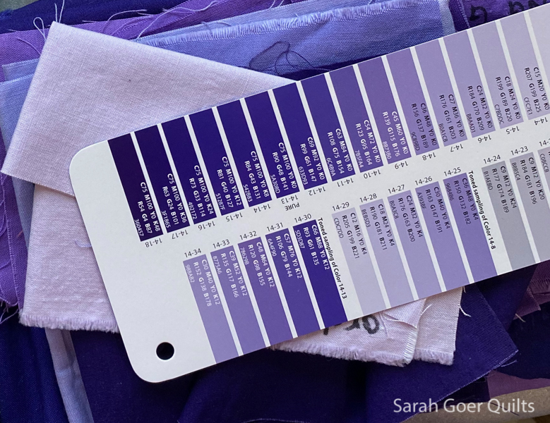
In phase one we each signed up for a color (or colors) and were assigned one or more colors with the related cards of the color tool shipped to us. I learned really quickly that even though the majority of my fabrics are blenders and read as a single color, most of them have a little bit of white in the print. Black and white are not allowed since they fall outside of the monochromatic spectrum of the color card. I pivoted to using solids, and found that I had a reasonable variety of purple solids in my stash that matched the color card, including a variety of values. I later supplemented with a small fabric order.
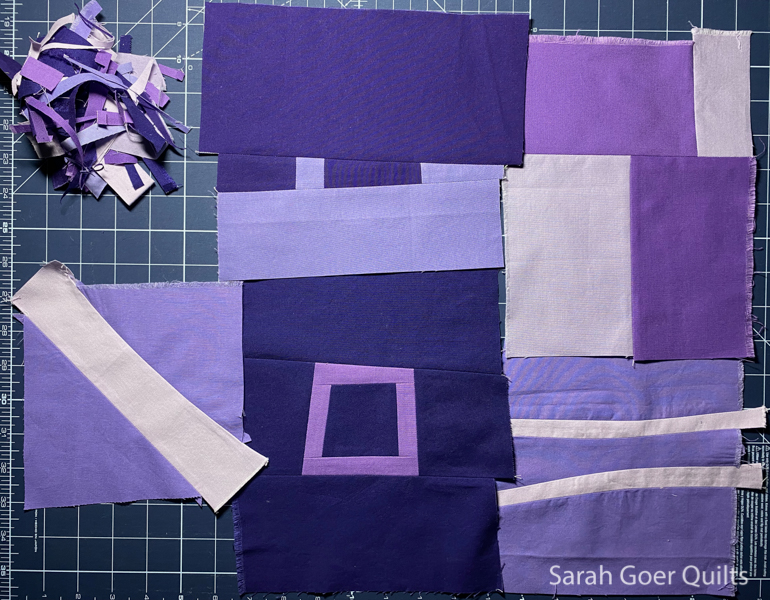
Inspired by the recent bee "block" I made for Elizabeth, I decided to work in sash strips for the overall composition of my Prism Play quilt and set to work creating numerous two-fabric blocks exploring a variety of planned improv piecing and value contrast. I settled on a gradient placement of the block for the overall composition and enjoyed finding ways for neighboring blocks to interact or connect with one another.
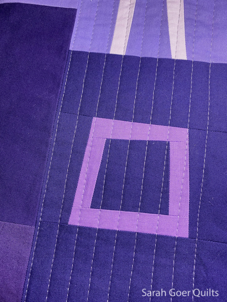
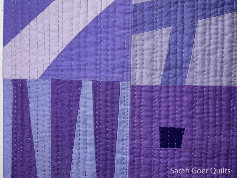
I finished my quilt with irregular matchstick quilting, starting with walking foot quilting with even spacing and then adding irregular spacing with my lines on the second pass. The quilt was finished with a faced binding.
Submissions were due last week and we'll hear next month which quilts have been juried into the exhibition. Having seen some of the other work that was created for this call, I am looking forward to seeing this amazing exhibition hanging in a gallery! Congratulations to everyone who participated in creating a piece to submit.
Artist Statement
I enjoyed the parameters of working within a strictly defined monochromatic palette. This means everything is about the value, so I played with higher and lower value contrast in the components of my piece. Working in the time of a global pandemic, it is hard not to think about connections… how connecting to individuals has ebbed and flowed, and how those connections that are happening look different at this time. As I constructed the overall composition of the piece, I looked for ways to make connections between each section. The columns illustrate how a community is dependent upon each other, each member contributing the building blocks of the whole.
Edited to add: Read about the Prism Play catalog that I created.