Tag Archives: Island Batik

10 Comments

The products featured in this post were given to my by Island Batik and Aurifil.

This month our Island Batik challenge was to try something new. There are so many options in the quilting world to try a new technique or tool. I was inspired by my friend Gayle’s recent quilt project where she used Fabric Magic on her quilt top. Here's one of her textured flowers:


Fabric Magic is a polyester fabric that "shrinks up to 30% when steam-activated." The way it works is that it is stitched to the back of a single layer of fabric in straight lines or free motion stitching. Then you apply steam (without touching the iron to the polyester fabric) and the Fabric Magic shrinks up and causes the quilting cotton to wrinkle up. Different density or types of stitching will achieve different results.

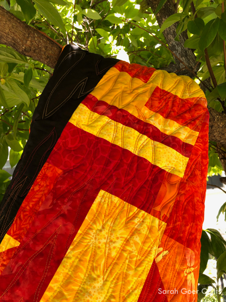
The Peach, Flame, and Tangy fabrics are from the Island Batik Basics line. I chose these as a starting point so I could submit this piece for the 2019 Pantone Quilt Challenge. The teal I added is a Cherio print (BE21-G1) from the Blenders line. I used Fabric Magic on three panels and, in true try it fashion, opted to use different free motion motifs on each.

The first, and my favorite, was back and forth wavy lines on the diagonal, stitched with Aurifil 50wt Fleshy Pink (#2420) on the Peach fabric. I think in addition to it being my preferred motif for ease of stitching and pattern of texture it creates, the technique just shows up better on lighter fabric due to being able to see the shadows from the texture more easily. The stitched area shrunk up from 17" wide to approximately 14 1/2" wide, about a 15% shrinkage.

My second section was pebbles on my teal panel with Aurifil 50wt Jade (#4093).

And my last section was spirals on the Flame fabric with Aurifil 50wt Red Orange (#2245). I didn't make a panel on the Tangy fabric since I didn't have a thread color that would blend well.

At this point I used my textured and non-textured fabrics to cut sections with smooth, gentle improv curves. I initially considered the sections to be horizontal, but decided in the end to rotate the quilt so they were in a vertical layout. I felt this orientation both worked better with the finished dimensions, and also gave a feel of coral and seaweed in the ocean.

I used a remnant of Quilter’s Dream Select 100% cotton batting that was just about the perfect size. Since I was working on a small quilt and intended to stitch on either side of each seam to stabilize the quilt before more quilting I opted not to baste. (Channeling Dora Cary!). I echoed each side of the curved seam on each non-textured fabric. (The textured sections did not get quilted, but if used in a larger section one could do some quilting on top of the previous stitching lines.) After my echo stitching, I chose nesting C curves, inspired by Mel Beach’s recent finish. I used overlapping curved lines on the two end sections.

I used the rest of the piece of Tangy fabric to make binding, knowing that I'd have way more than I needed and will utilize it on a future project. Isn't it so cute on my Binding Baby!? Usually I favor machine binding, but due to the textured sections I opted for a hand bound finish.

Living Coral finished at 22" x 13 1/2".


Be sure to check out what the other Island Batik Ambassadors are trying out this month!

This is also my contribution to the 2019 Pantone Quilt Challenge in the Minis category. (I'm in the USA.) And, it's my OMG for June (which I'll try to remember to linkup with the finishes at the end of the month). ;-)

I've linked up to June Favorite Finish and Beauties Pageant.

Thanks for visiting!

12 Comments

Well, I'm so out of OMG practice that when I met my goal last month, I totally forgot to linkup my finish. Oops. Onward...

This month's goal is a two-fer. My Island Batik project challenge is to try something new. I've chosen the product Fabric Magic by Pellon as my something new. A few weeks ago I looked at my "want to make" list and had significantly more on the list that time would allow in my life. I had to eliminate some fun "wants" like finishing the Trinket quilt top by the sew along deadline (you can see all my blocks on Instagram), and participating in the Riley Blake quilt challenge. I was nearing the realization that I would have to skip participating in the Pantone Quilt Challenge (which would be a bummer after participating in 2017 and 2018) when I realized that I could double dip with my Island Batik project. This year's Pantone color of the year is Living Coral. I've pulled these three fabrics (Tangy, Flame, and Peach) to start with (though I imagine I will add other colors). I also have some improv curves in mind. I'm giving myself a week to get it done. :-)

coral, flame, and peach colored batik fabrics with a package of Fabric Magic by Pellon

P.S. For anyone still wanting to participate in the Pantone Quilt Challenge, I shared some Living Coral color palettes.

I'm linking up to the June OMG goal setting party. Someone remind me to linkup my finish when I post it. ;-)

24 Comments

The products featured in this post were given to me by Island Batik, Hobbs, and Aurifil.

This month's Island Batik challenge is Make It Modern with Hobbs. Last month for the AccuQuilt challenge I used my cool color scraps with a neutral background. This month, I decided to use my warm colored scraps, and initially intended to use a tan neutral background. I toyed with the idea of using the same layout and the AccuQuilt again, but eventually decided that I would piece a scrappy slab. I didn’t have a final layout in mind and just started sewing.

When I finished piecing almost all of my scraps I had a slab that measured approximately 32“ x 42“. Since I was shooting for a 40“ x 40“ quilt I had plenty to work with. Along the way I decided to swap out my tan neutral background, in favor of a solid black batik instead. I really love how the variety of warm colors pop against the black. I had realized that the light tones of the yellows were going to blend into the tan background more than I wanted them to.

My quilt back is color blocked, pieced from remnants of the Petting Zoo fabric collection that I used in a previous project, with a little more solid black.

And for my quilt top I opted for a simple overall layout with two wide vertical strips of my scrappy slab, and filled in the background with solid black.

The fiery palette was just asking for flame quilting. I chose three colors of Aurifil 50wt: Red (#2250), Burnt Orange (#1133), and Yellow (#2135). I searched for "line art of fire" on Google to get an idea for the shapes. Then I went for it. I started with the lowest row of red quilting, traveling in an uphill and then downhill direction across the quilt, then I echoed that line in the same color thread. I repeated paired lines of stitching across the quilt in each color. Last time I used Hobbs Tuscany 100% Wool I liked the puffy result of the higher loft, but felt that I hadn’t done the batting justice since my quilting had the same density across the whole project. This time I really wanted to have flatter areas and puffier areas. I switched gears from what was originally in my mind, but by doing a double row of stitching for each pass I created more texture than I would have had with single lines of stitching.

The back of the quilt really shows the texture so well.

Once the top was quilted and trimmed I started to think about binding. The easy option would have been a solid black binding for the whole quilt, but I couldn’t resist adding in some pieced binding and matching up with the piecing on the quilt top. I had a strip big enough from when I trimmed the quilt to be one edge of the binding though I had to adjust the width of each section since the quilt top had shrunk up a bit from the quilting. I had extra scrappy slab that I cut pieces from for the bottom edge of the binding. Lining everything up on the first pass of attaching the binding was a little tricky. I used pins at the seams so the binding would match up and worked backwards to the corners. I also opted to work with two pieces of binding that I would join on each of the two black sides. Finally, I had to decide what color to topstitch my machine binding. I really considered stitching black on black and orange on the scrappy sections, but decided in the end to use orange for the whole binding. This meant that the stitching would show up strongly on the black binding, but since I match my bobbin thread color to my top thread the orange thread on the bottom of the quilt would blend in more with the yellow orange and red I had used for quilting (and because most of the backing fabric is not black). Black stitching along the edge would have been more distracting on the quilt back. I used my basic machine binding technique.

I've been kind of lazy about quilt labels lately, but used my preferred method of making a label and attaching the label to the quilt back prior to quilting. I use a micron pen to do my writing. I realize now I forgot the name of the quilt: On Fire. I'll have to add that. ;-)

On Fire finishes at approximately 41" x 41".

Thanks for visiting! Be sure to check out the Make it Modern projects from the other Island Batik Ambassadors.

I'm linking up to TGIFF, Needle and Thread ThursdayPut Your Foot DownBeauties Pageant, and Favorite Finish.